Customer Experience is for life, not just for Christmas
Following the rise of Black Friday and Cyber Monday, we are becoming used to Christmas retail campaigns, including sales, offers, discounts that are all promoted as "too good to miss". For our own Christmas message, we wanted to explore and share some of the design approaches behind these campaigns, looking at good and bad examples of how we are persuaded to buy.
With £24bn taken by UK retailers over the 2015 Christmas period [1], this season is undoubtedly the most important time of year in the retail calendar.
Retailers understand existing and potential customers more than you might think and take insights from behavioural psychology to influence our actions online. This is mostly done in a helpful way for consumers but sometimes the ethics can be questionable.
Over half of all online UK sales are completed using a mobile device and this number is only set to increase. [2]
2014
2015
59.6%
Spending on gifts is the biggest category of spending per household over the Christmas period, representing 59.6% of total spend. [4]
UK consumer spending on mobile is projected to rise to £53 billion by 2024. [3]
24.4%
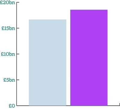
Online retail rose by 11% in the Christmas period for 2015 and accounted for almost one-quarter (24.4%) of Christmas spending. [4]
31.6%
In 2015, 31.6% of Christmas spending, £5.87bn, was conducted using smartphones and tablets. [4]
Upselling & auto-renewal
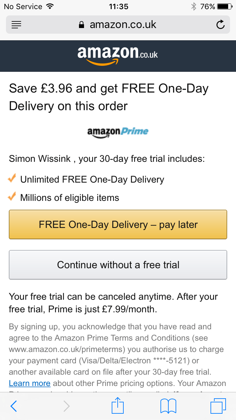
Amazon draw users to their Prime service with strong contrast around the sign up button and poor contrast around the important details, that after the free trial, the user will be billed monthly for the service.
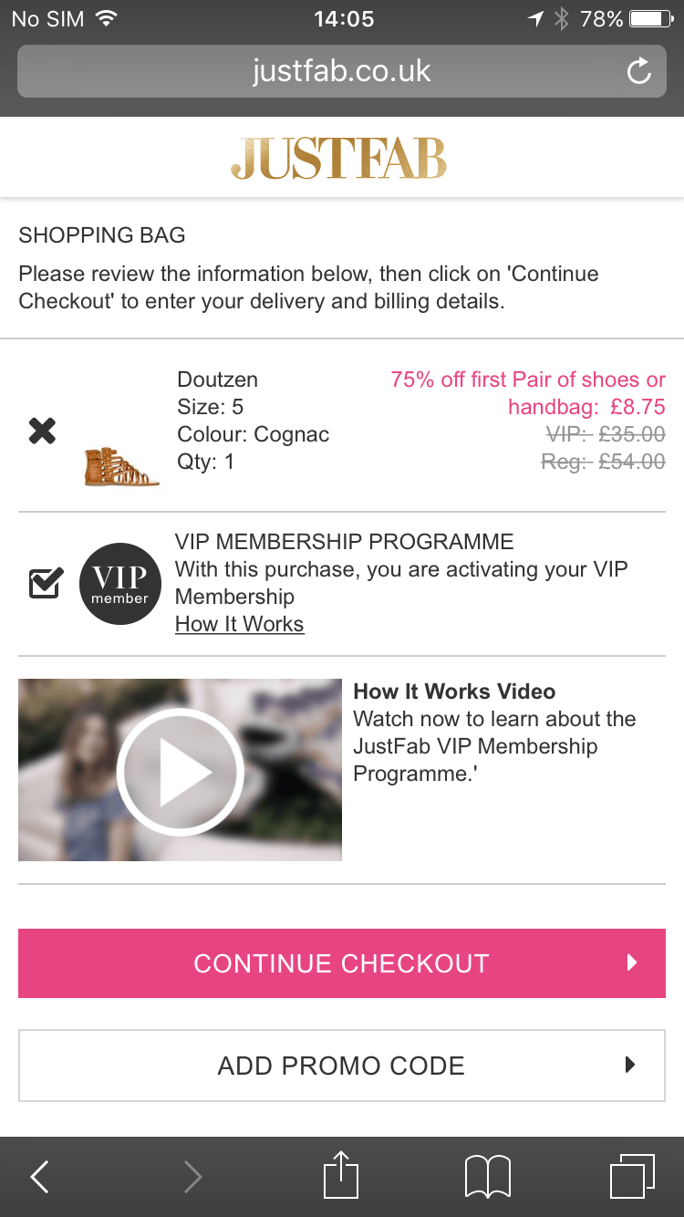
With discounting as a contributing incentive, limited access is used here to encourage customers to sign up to VIP Membership. Yet, nowhere is it clearly displayed that the user is in fact, signing up to pay a fee of £35 per month.
Buy it now or regret it later
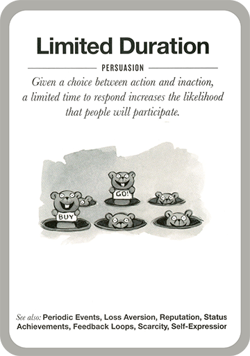
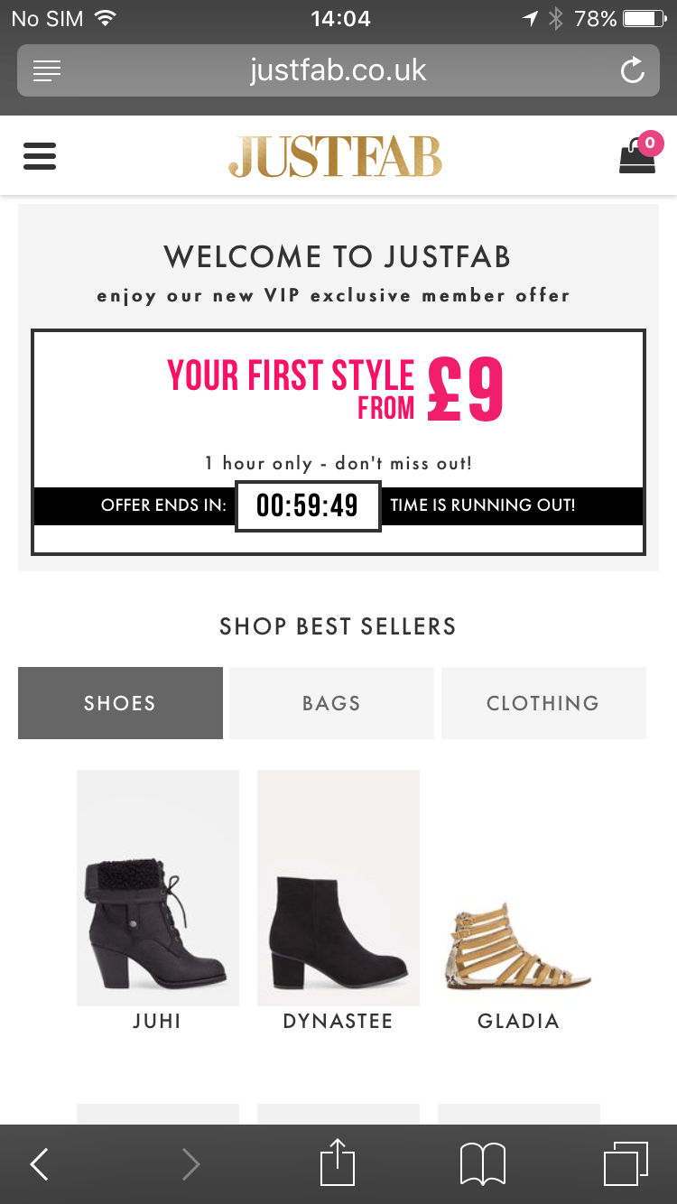
Shoppers hate to feel they’ve missed out. Just Fab capitalise on this fear by implementing design tactics, such as limited duration, urging customers to complete their purchases before the offer is no longer on the table.
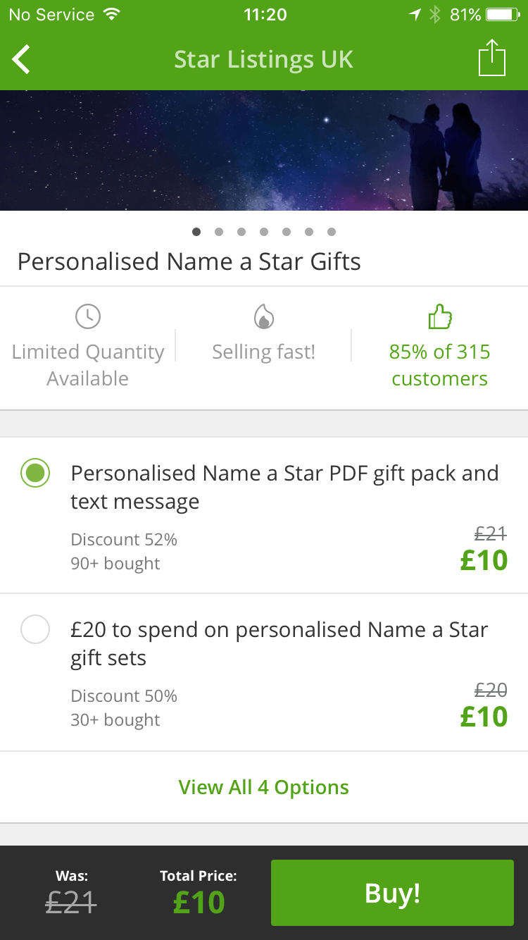
Groupon use scarcity here in perhaps not the best way possible, alluding to the idea that there are a limited number of stars available for naming and they are selling fast.
Checkout process manipulation
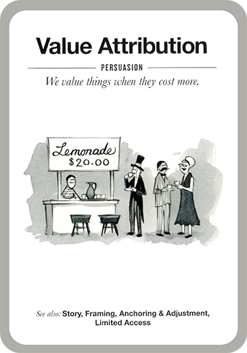
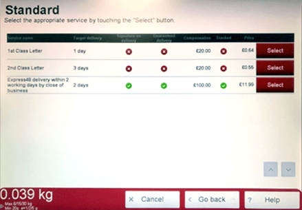
On Royal Mail's in-store kiosks, delivery options default to the most expensive. There is the assumption of value attribution on behalf of the user; they are not given the option to decide and are also often in a rush so stick with default options.
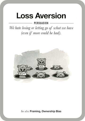
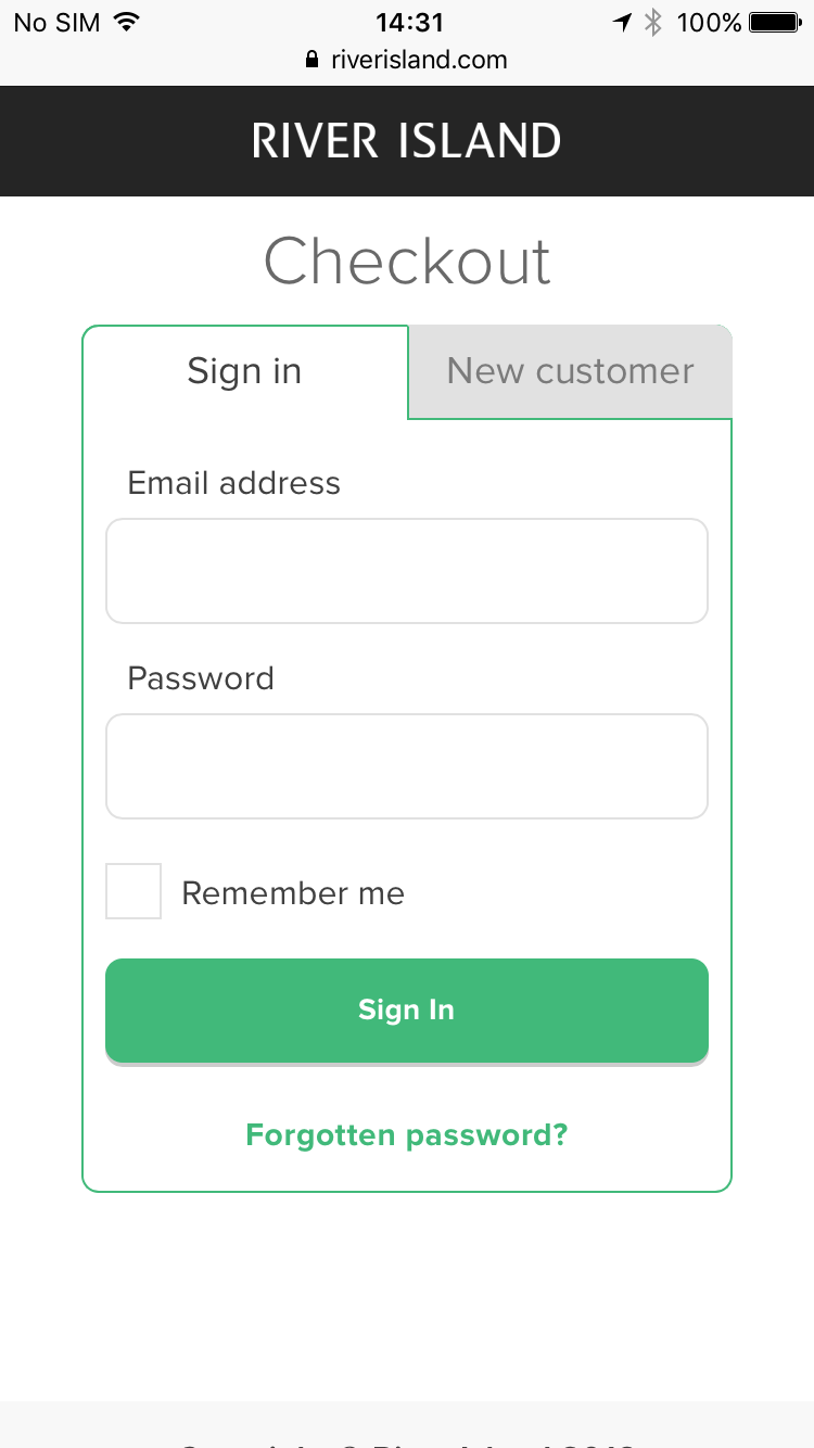
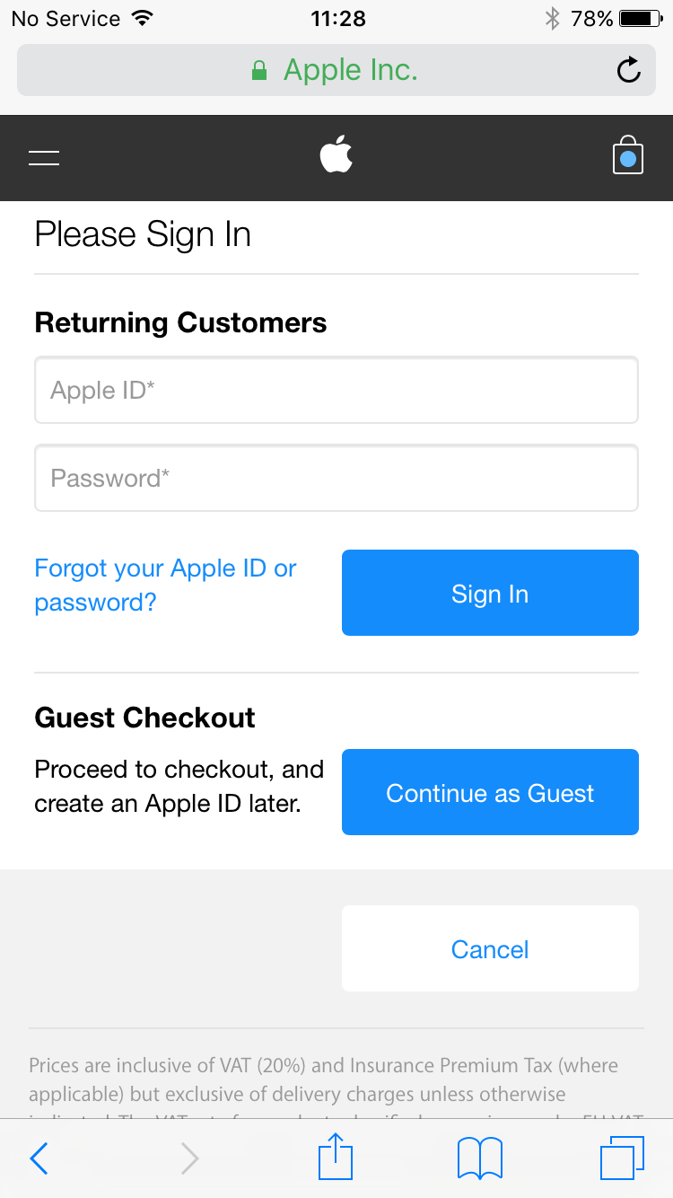
A clear and well-defined checkout process can make the difference between abandoned baskets and turning visitors into customers. Registering for an account encourages users to avoid losing their information on a return visit; yet, sign up forms can be time consuming to complete when placed during the checkout process.
River Island do not allow their customers to complete the checkout process without creating an account.
Apple give their customers the option to checkout as a guest; however, the disadvantage of this is that their data will not be saved for future transactions.
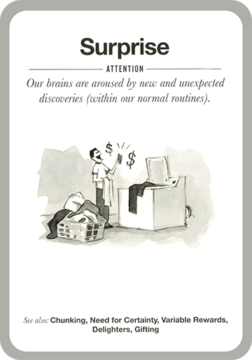
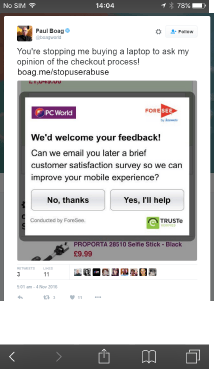
Surprising customers with feedback pop ups positioned at the wrong point in the process don’t help them or the business.
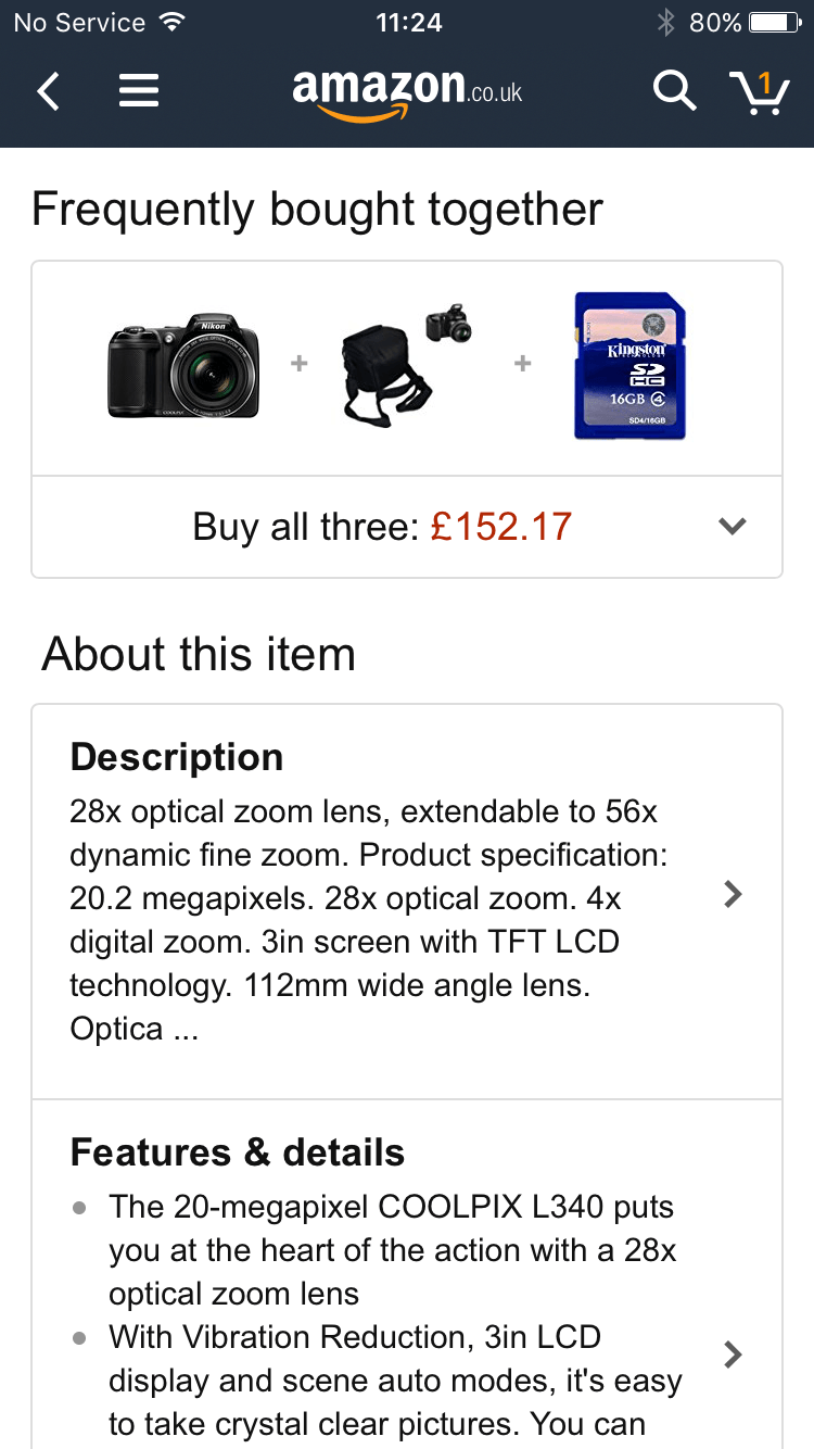
Users are encouraged to purchase more than they need through the use of collecting. Amazon appears to offer a discount but the price displayed is not discounted from the total of the individual items.
The small print is small for a reason
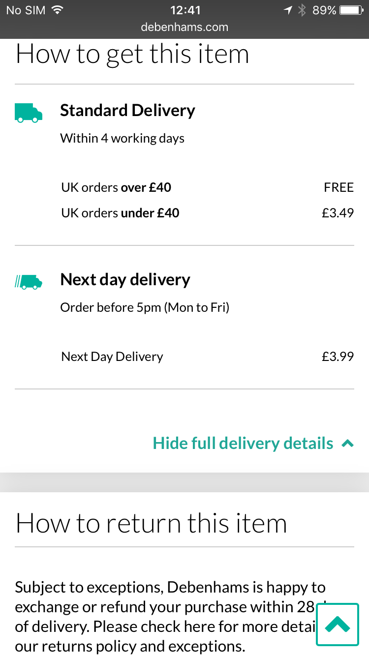
Chunking is used to great effect here with clear contrasts and succinct messaging around delivery.
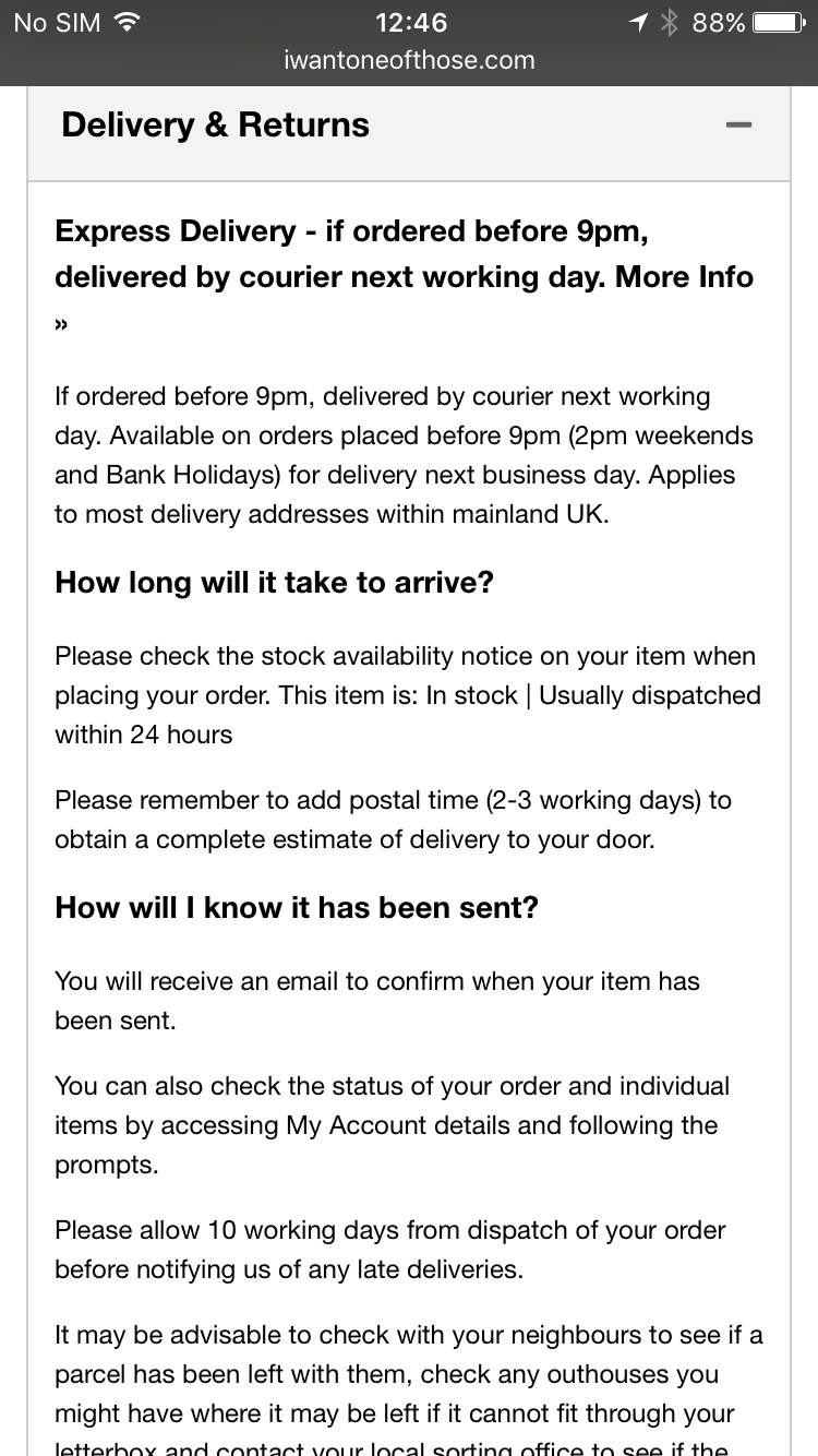
Hidden T&Cs and information displayed in lengthy narratives is poor usage of chunking, can confuse customers and allow retailers to gloss over key messages. Vague language will not inspire confidence e.g. "Usually dispatched within 24 hours".
Offering trust & reassurance
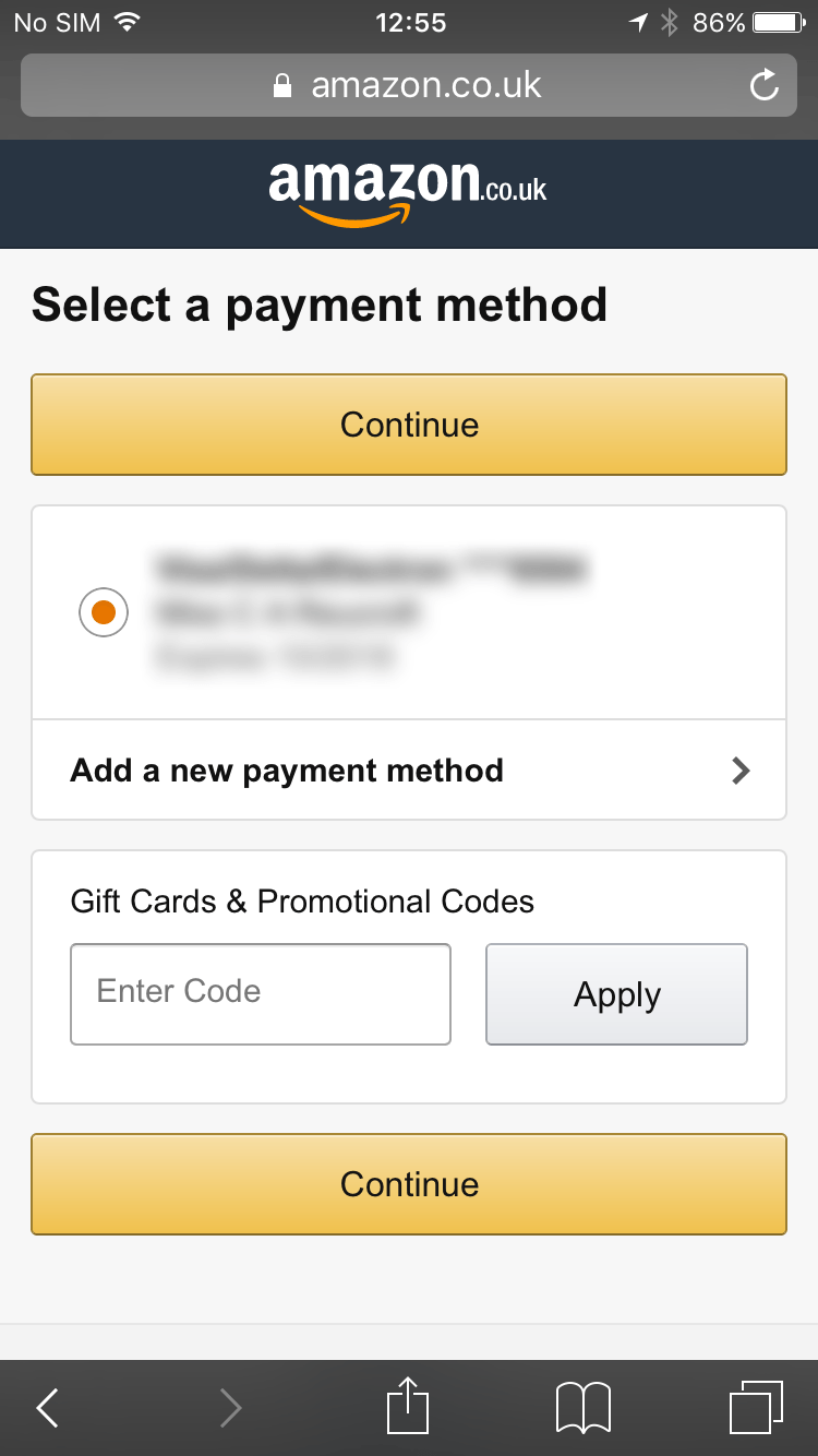
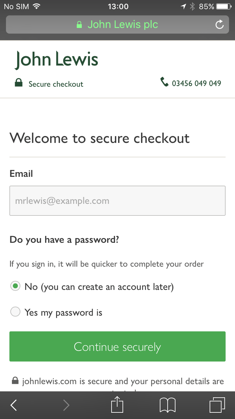
John Lewis gives its users confidence at a crucial point in the checkout process with a clear call to action to "Continue securely". Amazon reassures users with micro-copy below its call to action with "You can review this order before its final" on desktop; yet on mobile, this copy is stripped out at the same point in the process.
We’re pack animals
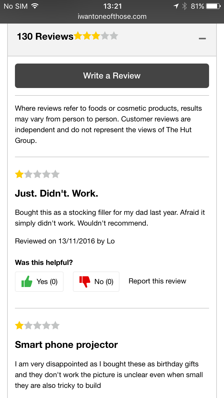
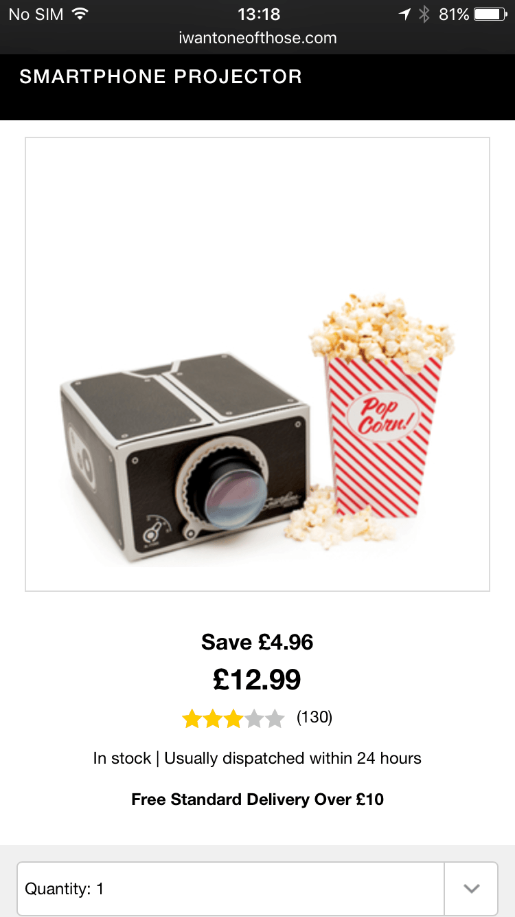
User reviews increase conversions. Reviews are essential to potential buyers as a way of alleviating any doubt they may have over a product.
The number of reviews is capitalised on here, displaying immediately beside the product, yet the actual reviews are buried at the bottom of the page. This can be misleading to users as the ratings score does not reflect the severity of individual reviews.
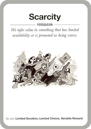
Shoppers beware, designers be kind, businesses be ethical
Understanding behavioural psychology and applying persuasion techniques in the right way are important to encourage successful online interactions. We used a selection of the 53 Mental Notes cards (www.getmentalnotes.com) to guide our thoughts around the design techniques used.
Nexer Digital design, develop and support websites, applications and other digital products that are highly usable, accessible and engaging. We believe that users should be at the heart of every solution and considered at every stage of the design and development process. Please contact shaun.gomm@nexergroup.com if you would like to discuss how we can help you.
For some more examples, take a look at www.darkpatterns.org and if you happen to spot any examples of your own, please share them out with #darkux.